CTK Unveils New Parish Logo
The new parish logo was unveiled during the Parish Fiesta Fellowship last November 24.
Th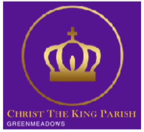 e journey to a new logo began when Fr. Steve arrived and the problem was posed – after 40 years as a parish and 30 years with a new church, Christ the King Parish Greenmeadows never had a consistent logo, with various symbols and imagery being adopted at different times to capture the spirit and essence of the parish. When the parish began, those in charge used a traditional painted graphic of Christ the King, the type of image you could easily ‘google’. In the early 2000s, the parish used a stylized sketch of the church itself, trying to capture the circular footprint as well as the rising roofline and the carillon tower at the back of the church. Even now, that same imagery is used in our screensaver inside the church.
Sometime 2005, CTK also used photos of the giant standing statue at the altar – in fact, if you visited the CTK website a month ago, you would still have seen the altar image on the home page. Somewhere along the way, an escudo or shield was also designed, consisting of several elements – crown, dove, fleur de lis, three circles, etc. This ‘coat of arms’ was being used in our FB page but nowhere else. Then when the Willy Layug statue was commissioned by Fr. Bong and installed in the front garden, CTK began to use its image for some of its communications, especially the Herald and the liturgical schedules. But with all these representations, CTK lacked the one consistent logo or symbol of the parish that the priests, staff, and PPC ofQicers and members could use in all the communications. CTK needed a logo that would immediately establish the parish identity and which every ministry, mandated organization, and renewal movement could use, without fear of violating our identity standards.
When consulted, Fr. Steve Zabala said he wanted an identity with a simplified look, using at least one of the several elements of Christ as King. It could use the crown, a symbol of honor, power and kingly reign. Or even a scepter or royal staff, to symbolize authority. Or even a throne, to symbolize the sovereignty, power, dominion and authority of a king.
But Fr. Steve also argued that we also had to make sure the new logo was a familiar image. The image of Christ the King at our church altar didn’t have a throne or scepter. The Layug scupture has a scepter but no throne. But was common in all the images in our parish was a crown. The next question was – but what kind of crown? Fr. Steve wanted simple, dignified, at the same time a modern rendering so as not to turn off the millennials. And what about the text? Perhaps in gold and silver, symbols of kingly wealth.
So digital marketing expert Sheryl Coronel and her Alfa Fusion team came up with a number of studies. After several late nights and iterations later, the official Christ the King Parish Greenmeadows logo was finally approved by Fr. Steve and unveiled at the Parish Fiesta Fellowship.
The logo was announced the very next day at the electronic slide show at the steps of the main church. Within a week, the logo was also adopted for the website homepage, for the Herald newsletter, for the printed tarp bulletin board, and for the Stewardship Committee’s refrigerator magnet giveaway. Plans are also underway to replace the stock parish envelopes and stationery once existing stocks are used up.